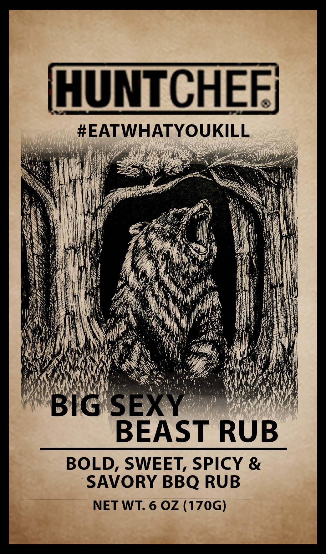
Hunt Chef was born from a passion for the wilderness and the culinary arts. Chef Jeremy Critchfield, an aficionado of the great outdoors and a maestro in the kitchen, saw the opportunity to marry his two loves. His creation, a line of seasonings, is designed to enhance the natural flavors of whatever bounty you have gathered, be it from the wild, your local grocery, or your own backyard garden. The brand exudes a unique personality—serious yet whimsical. This duality is reflected in their product names and overall branding. When I first encountered their packaging, I was a little underwhelmed. I did think that the art style they used was reminiscent of my own. Inspired, I chose five of their seasonings and reimagined their packaging through my artistic lens. My goal was to amplify the visual appeal while preserving the brand's core identity. I opted for realistic illustrations to maintain the serious tone. At the same time, I played into the whimsy of names like 'Taco Takedown' and 'Big Sexy Beast Rub'. Each of my designs began with a deep dive into the seasoning profiles, understanding which meats they most complement. I then selected an animal representative for each seasoning. The result? My reimagined packaging captures the essence of the company while adding that extra visual pop to turn heads in the aisles, inviting consumers into the flavorful world of Hunt Chef seasonings. My design is a testament to the art of attraction—where the eye goes, the appetite follows.
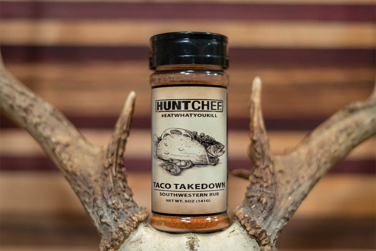
Hunt Chef Taco Takedown, Pen and Photoshop, 2024
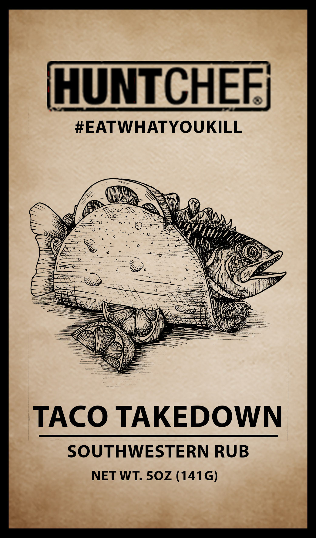
Hunt Chef Taco Takedown Lable, Pen and Photoshop, 2024

Hunt Chef Low Down & Dirty Rub, Pen and Photoshop, 2024

Hunt Chef Low Down & Dirty Rub Lable, Pen and Photoshop, 2024
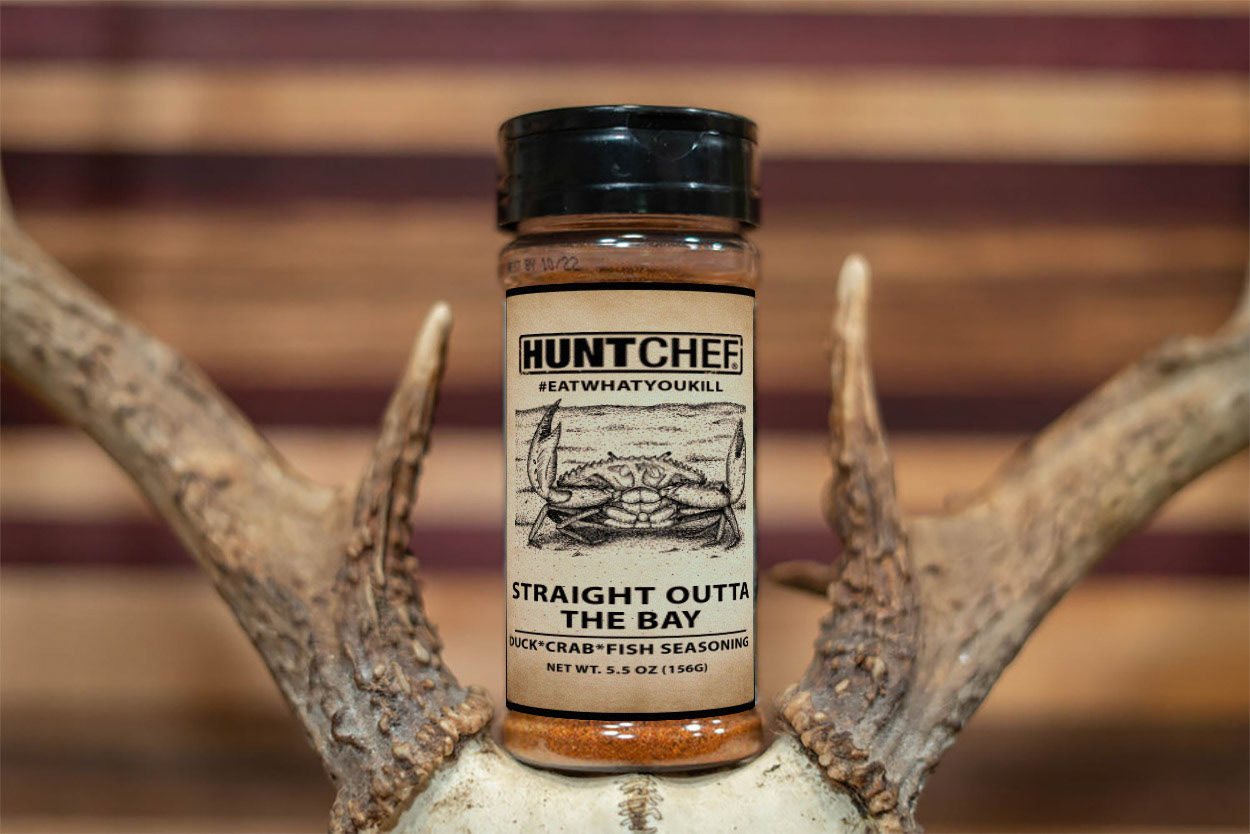
Hunt Chef Straight Outta the Bay, Pen and Photoshop, 2024
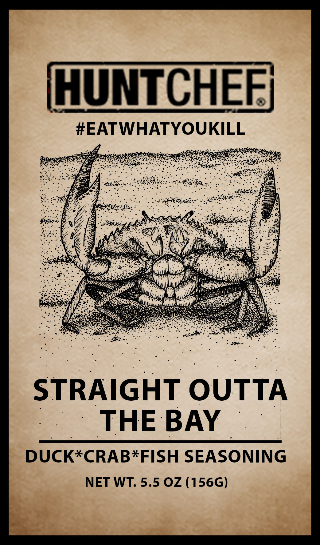
Hunt Chef Straight Outta the Bay Lable, Pen and Photoshop, 2024
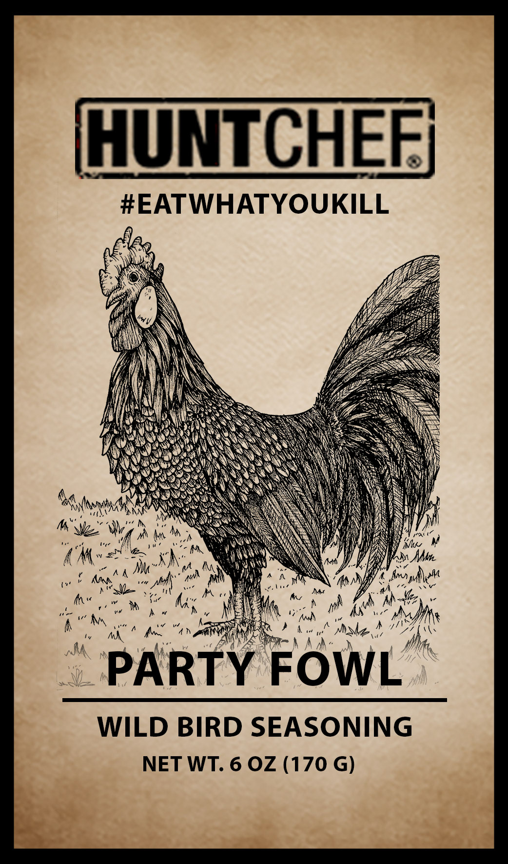
Hunt Chef Party Fowl, Pen and Photoshop, 2024
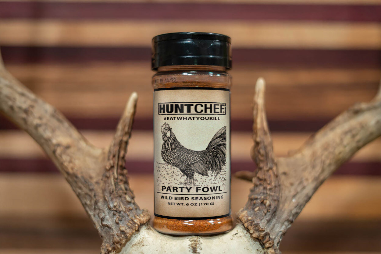
Hunt Chef Party Fowl Lable, Pen and Photoshop, 2024
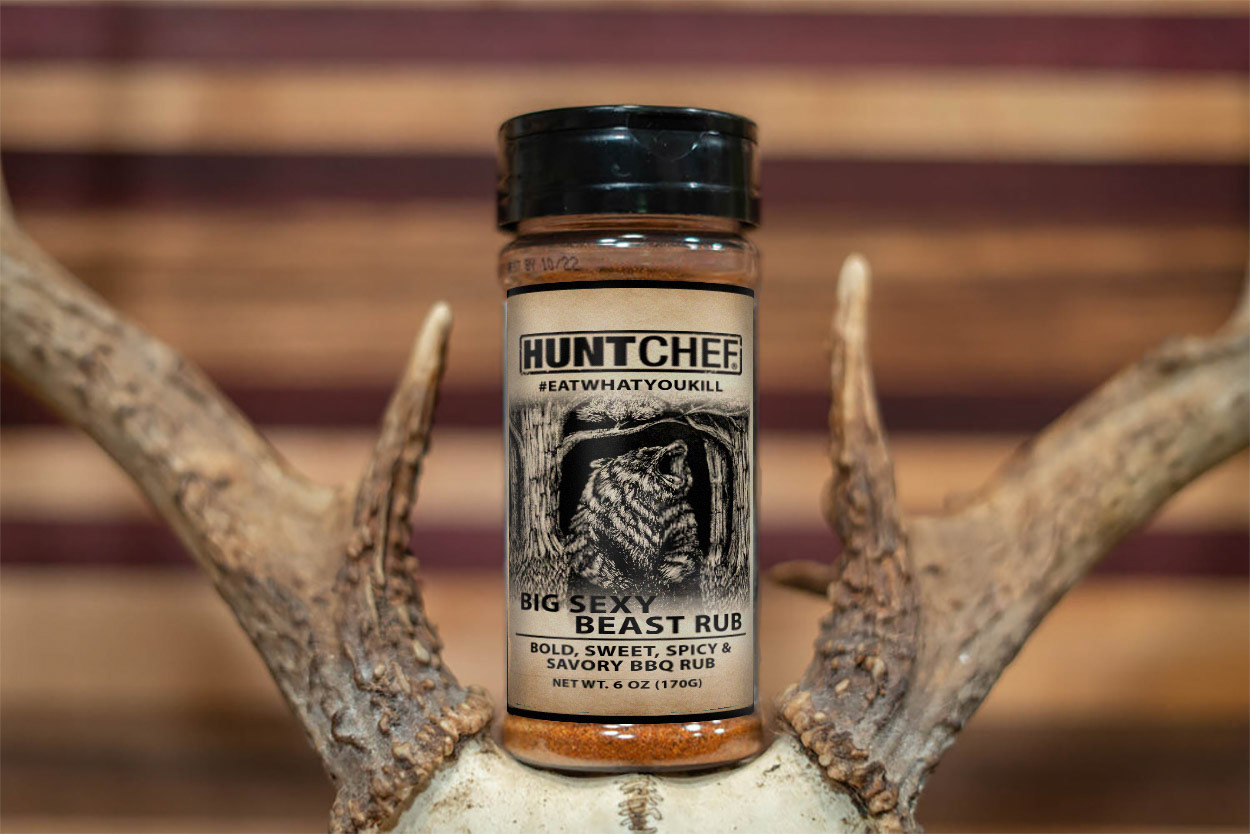
Hunt Chef Big Sexy Beast Rub, Pen and Photoshop, 2024
